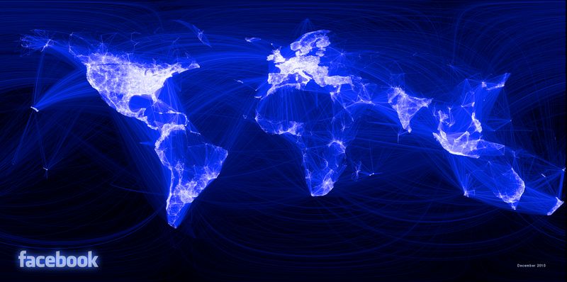
Visualising friendships on Facebook
December 14, 2010, 1 min read

This is how a social graph of 500 million connected people looks like, according to Facebook’s intern Paul Butler. In this post, he explains the process he followed to get the visual result you see above.
“When the data is the social graph of 500 million people, there are a lot of lenses through which you can view it. One that piqued my curiosity was the locality of friendship. I was interested in seeing how geography and political borders affected where people lived relative to their friends. I wanted a visualization that would show which cities had a lot of friendships between them.”
Some might believe that Facebook is the major social network in every country, but that is not true.
You may have noticed some gaps on that world map. Countries like Brazil, Russia, China, Kazakhstan and large parts of central Africa and Latin America seem to have minimal activity or be totally absent from the world map. For the most part this is due to limited network infrastructure, but not always, as Facebook has failed to penetrate certain markets so far.
Brazilians seem to prefer Bebo.com, while Vkontakte.ru is hugely popular in Russia. China has three major social networking websites with Renren.com being the most popular one, and Chinese users seem to be more focused on the gaming aspect of social networks (FarmVille originated in China!).